How our PMF system uses 8 leading indicators to track fit
- Chris Hug
- Nov 27, 2025
- 13 min read
Updated: Dec 14, 2025
Most companies track ARR, NRR, and CAC. By the time those metrics decline, the underlying problem has been ongoing for 6-9 months. The signals were there. Nobody was measuring them.
To handle that complexity, we built our PMF system.
We handle the complexity. You get the insights.
Our system tracks 8 leading product-market fit indicators, identifies patterns across them, and delivers actionable recommendations. You don't build the measurement infrastructure. You don't analyse causal chains. You don't map signals to frameworks or templates.
We do that for you.
This behind the scenes article shows you the eight leading indicators we can track, how they predict outcomes months before revenue metrics shift, and how we turn that complexity into clarity.
At-a-glance
The challenge:
Tracking PMF signals, mapping them and defining measures to strengthen is complex
Indicators create causal chains (January adoption weakness → July ARR decline)
Traditional KPIs (ARR, NRR, CAC) only tell you where you've been, not where you're going
How our system works:
Phase 1: Exploration → Quick market-segment checks and insights
Phase 2: Data gathering → Structured evidence collection
Phase 3: Diagnosis → Pattern recognition across all 8 indicators and dimensions
Phase 4: Execution → Actionable recommendations with clear ownership
The technology stack:
Structured databases for evidence management
Visual mapping for customer segment analysis
AI frameworks for research, pattern recognition and synthesis
Proprietary logic connects indicators to diagnostic insights
Related reading:
Part 1: How to measure product-market fit: The 5 stages of PMF strength
Part 2: Diagnosing PMF: The 5 dimensions where fit weakens
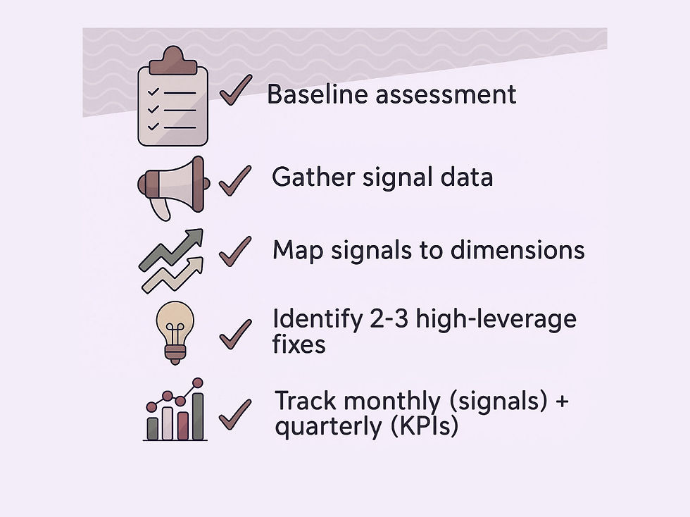
Part 3: Implementation guide: Self-assessment and tracking

What you get: The diagnostic output
When we run this analysis for your company, and manage the complexity. You see:
1. Five-dimensional dashboard with strength indicators:
Customer: 7.7/10 🟡 Moderate
Offering: 7.3/10 🟡 Moderate ← weakest
Story: 7.6/10 🟡 Moderate
Channel: 8.1/10 🟢 Strong
Company: 8.2/10 🟢 Strong
2. Executive summary showing:
Which dimension is weakest (Offering)
Why it's weak (Adoption signal at 6.0/10 due to onboarding friction)
Team ownership (Product + Engineering)
Expected PMF lift (+2-3 points if fixed)
3. Dimension-by-dimension breakdown with:
Signal contributions (which signals feed this dimension)
Root causes from data (reconciliation flags, data gaps)
What would move this to 8/10 (specific actions)
Recommendations (3-6 prioritised actions with impact/effort)
4. Implementation tasks linked to recommendations:
Task database entries with ownership and timelines
Links back to parent recommendations (bidirectional tracking)
Progress tracking systems
We handle the complexity. You get actionable insights with clear team ownership.
The 8 leading product-market fit indicators we track
Revenue metrics tell you where you've been. Leading indicators tell you where you're going.
We track eight indicator categories that predict revenue outcomes six to nine months before they show up in ARR. We can monitor all eight for you, identify patterns across them, and translate those patterns into specific actions. We do this inside-out (your view and data), and outside-in (market and public data), and connecting data.
Here's what each reveals:
1. Adoption signals
Why it matters: If customers struggle to see value in the first 30 days, renewal rates will drop 90 days later. Strong adoption means value delivered fast. Weak adoption means friction between purchase and value delivery.
What it reveals: Time-to-value patterns, activation rates, early usage frequency, and user expansion within accounts. When we see customers taking weeks to return after activation and initial usage, that's a warning sign, even if retention metrics still look strong. The adoption weakness will show up in churn 60-90 days later.
We've seen companies with 85% activation rates drop to 62% over two quarters. Revenue looked fine. Six months later, churn spiked. The adoption signal predicted it.
2. Retention signals
Why it matters: Retention lags adoption by 60-90 days. If adoption weakens in Q1, retention drops in Q2. By tracking both, we predict churn before contracts come up for renewal.
What it reveals: Renewal patterns, net revenue retention, usage frequency over time, and feature adoption depth. When customers renew but don't expand, or when usage frequency declines month over month, that reveals gaps in sustained value delivery.
One pattern we track: customers who reduce seat count at renewal. They're signalling a weak fit before they churn entirely. Catching this early means you can intervene while they're still customers.
3. Demand signals
Why it matters: When win rates drop from 35% to 20%, it's often not a sales execution problem. The market is telling you something shifted. Demand signals reveal market receptivity in real time.
What it reveals: Inbound interest trends, pipeline velocity, win rates, sales cycle length, and deal size patterns. When sales cycles lengthen by 40% with no change in deal size, that reveals weakening urgency or clarity in your market positioning.
We track win rate patterns specifically. Steady win rates with lengthening sales cycles reveal different issues than declining win rates with stable cycle length. The combination tells the story.
4. Value & proof signals
Why it matters: Customers who expand usage and refer others prove they're getting value. Customers who negotiate a lower price or limit their commitment signal weak value perception. Sean Ellis found that 40% of users saying they'd be "very disappointed" without your product is the threshold for strong PMF.
What it reveals: Expansion revenue patterns, referral rates, case study willingness, negotiation behaviours, and unsolicited advocacy. When customers stop expanding or start negotiating harder on renewals, that reveals gaps between delivered value and customer expectations, even if they're not churning yet.
Example: A company saw expansion rates drop from 130% to 105% NRR while gross retention remained at 92%. They thought they were fine. The value signal indicated a pricing misalignment 6 months before retention declined.
5. Persona fit signals
Why it matters: Persona drift compounds. Wrong customers churn faster and refer similar wrong-fit prospects, creating a negative flywheel. If your ICP is mid-market CEOs, but most deals are with SMB procurement heads, the fit is drifting.
What it reveals: Customer profile patterns, retention by segment, expansion by persona, and velocity differences across customer types. When your fastest-converting customers have 40% lower retention than your slowest-converting customers, that reveals gaps in your target audience.
We've seen teams chase easier-to-close customers when demand weakens. Short-term pipeline relief. Long-term retention damage. The persona fit signal catches this before churn spikes and reveals that your target sweet spot is off.
6. Competitive pressure
Why it matters: The loss pattern tells you where fit is weak. Losing to competitors signals offering gaps. Losing to the status quo signals urgency gaps. "Decided to wait" signals unclear value.
What it reveals: Win/loss patterns, competitive mentions in sales conversations, frequency of pricing pressure, and trends in feature gaps. When you start losing more deals to "decided to wait" instead of competitors, that reveals different issues than when competitive losses increase.
One pattern: companies that suddenly face pricing pressure across all deals. That usually reveals gaps in demonstrating ROI, not actual pricing problems. The competitive pressure signal separates perception from reality.
7. Market attractiveness
Why it matters: Even strong execution can't overcome a shrinking market or a category that requires years of customer education. Market attractiveness sets a ceiling on growth potential.
What it reveals: TAM size and growth rate, category awareness, buyer readiness, education requirements, and regulatory or technology shifts. When the market is growing 40% annually, but your growth is 15%, that reveals internal issues. When the market is growing 8%, and you're at 15%, that's outperformance despite headwinds.
We track category readiness specifically. Markets where buyers understand the problem and actively evaluate solutions behave differently from markets where you first need to educate buyers about the problem. That changes everything about go-to-market.
8. Risk severity
Why it matters: High-risk patterns predict revenue volatility even when current metrics look strong. One customer representing 40% of ARR is a time bomb, even if growth is good today. Risk patterns can also be linked to regulatory or to specific market/segment entry requirements.
What it reveals: Customer concentration, channel dependency, persona concentration, cohort retention patterns, and infrastructure dependencies. Also, when a market or segment is served by a majority of on-site companies, it is clear that a local presence with knowledge of local laws, regulations, culture, and other demographic specifics, such as language, is key.
We've seen companies with strong growth metrics but extreme concentration, only to have their top customer churn. Or companies that had success in their home market and expanded to a new one, just to find out after six months that there were local requirements they couldn't meet with their products. The risk severity signal reveals vulnerability before acting.
The mapping logic
Eight signal categories provide precision. Five dimensions (Customer, Offering, Story, Channel and Company) provide clarity on who acts.
Our system compresses the eight signals into five dimensions using weighted formulas. You don't need to understand the math to use the system, we handle that complexity.
But for transparency, here's exactly how it works.
The baseline formulas
Customer Dimension (Who you serve)
Formula: (Persona Fit × 60%) + (Adoption × 20%) + (Retention × 20%)Why these weights: Persona fit is the primary signal for "right customer." Adoption and retention validate that fit quality is real, not assumed.
Offering Dimension (What you deliver)
Formula: (Retention × 40%) + (Adoption × 30%) + (Value & Proof × 30%)Why these weights: Retention is the strongest signal of sustained product value. Adoption shows initial quality. Value & proof validates that customers achieve outcomes.
Story Dimension (How you communicate value)
Formula: (Demand × 50%) + (Value & Proof × 30%) + (Competitive Pressure × 20%)Why these weights: Demand shows market receptivity to your messaging. Value & proof reveals whether you can communicate value clearly. Competitive pressure indicates positioning clarity.
Channel Dimension (How customers discover and buy)
Formula: (Demand × 50%) + (Market Attractiveness × 40%) + (Competitive Pressure × 10%)Why these weights: Demand shows channel effectiveness. Market attractiveness reveals quality of market access. Competitive pressure indicates channel differentiation.
Company Dimension (How you execute and deliver)
Formula: (Risk Severity inverted × 50%) + (Retention × 30%) + (Market Attractiveness × 20%)Why these weights: Risk severity (inverted) shows execution capability—low risk means strong capability. Retention validates delivery quality. Market attractiveness reflects strategic execution.
Note on adaptation: These are baseline weights. We adjust them based on your company stage (Stage 1 companies weigh Persona Fit differently than Stage 3), your customer segment (B2B SaaS patterns can differ from med-tech), and data availability (if you lack product analytics, we can not only adapt the formulas accordingly, but use alternatives to gather suitable data).
Worked example: Adoption weakness
Scenario: A Stage 2 company (30 customers, CHF 1.2M ARR) notices these signal changes over 3 months:
Adoption rate: 78% → 61% (declining)
Time-to-value: 4 weeks → 8 weeks (doubling)
Retention (NRR): 108% → 105% (slight decline)
Demand (win rate): 28% → 28% (stable)
Persona fit: No noticeable drift
Step 1: Score the signals
Adoption: 6.0/10 (significantly weakened)
Retention: 8.5/10 (still strong, minor decline)
Demand: 8.5/10 (stable)
Value & Proof: 7.0/10 (moderate—affected by adoption issues)
Persona Fit: 8.0/10 (strong, no drift)
Competitive Pressure: +1/5 (slightly favourable, no major change)
Market Attractiveness: 4/5 (strong market)
Risk Severity: 2/5 (low risk, inverted to 8/10)
Step 2: Calculate dimension scores
Offering Dimension:
(8.5 × 0.40) + (6.0 × 0.30) + (7.0 × 0.30) = 7.3/10Customer Dimension:
(8.0 × 0.60) + (6.0 × 0.20) + (8.5 × 0.20) = 7.7/10Story Dimension:
(8.5 × 0.50) + (7.0 × 0.30) + (6.0 × 0.20) = 7.6/10Note: Competitive Pressure +1/5 normalised to 6.0/10
Channel Dimension:
(8.5 × 0.50) + (8.0 × 0.40) + (6.0 × 0.10) = 8.1/10Note: Market Attractiveness 4/5 = 8.0/10
Company Dimension:
(8.0 × 0.50) + (8.5 × 0.30) + (8.0 × 0.20) = 8.2/10Note: Risk Severity 2/5 inverted = 8.0/10
Step 3: Diagnose the weakest dimension
Customer: 7.7/10 🟡 Moderate
Offering: 7.3/10 🟡 Moderate ← weakest
Story: 7.6/10 🟡 Moderate
Channel: 8.1/10 🟢 Strong
Company: 8.2/10 🟢 Strong
Primary weakness: Offering dimension (7.3/10). The adoption signal (6.0/10) is dragging it down despite strong retention.
Step 4: Map to team ownership and action
Team ownership: Product + Engineering (Offering dimension)
Diagnosis: The product isn't delivering value fast enough. Customers are taking 8 weeks to see value (was 4 weeks). This isn't a targeting problem (Customer dimension is 7.7/10). This isn't a positioning problem (Story/Channel dimensions are moderate but stable). This is a product delivery problem.
Recommended actions:
Reduce onboarding friction (audit the 8-week journey, identify bottlenecks)
Improve time-to-first-value (what delays activation?)
Enhance early feature discovery (are customers finding core value?)
Expected impact: If onboarding improves and time-to-value drops back to 4 weeks:
Adoption signal: 6.0 → 7.5/10 (within 60 days)
Offering dimension: 7.3 → 7.9/10 (within 90 days)
Retention impact: Minimal immediate change (already strong), but prevents future erosion
Validation 90 days later: Adoption rate improved to 72%, time-to-value dropped to 5 weeks, and offering dimension rose to 7.8/10.
How indicators create causal chains
Indicators don't operate independently. They create cascading effects.
Example causal chain:
January: Adoption weakens. Customers taking 8 weeks to see value, was 4 weeks. Activation rate drops from 78% to 61%.
March: Retention follows. Renewal conversations are harder. Churn increases from 8% to 12%. Usage frequency is declining.
May: Demand signals drop. Word of mouth slows. Sales cycles lengthen from 32 days to 47 days. Win rates decline from 28% to 19%.
July: Revenue impact. ARR growth slows from 50% to 30%. Burn multiple spikes from 2.1x to 3.8x.
If you only measure revenue, you see the problem in July or October, months after it started. If you measure indicators monthly, you catch it in January and intervene before it damages revenue.
This is why our system tracks indicators, not just outcomes. By the time outcomes decline, you've already lost months.
The four-phase diagnostic process our system runs
Our PMF system runs diagnosis through four sequential phases. Each phase builds on the previous one.
Phase 1: Exploration
Objective: Quick assessment of market-segment opportunity.
What we do: We run rapid screening (0-25 score) to determine whether a market-segment combination is worth deeper analysis. We identify 3-5 promising opportunities for you to pursue.
What you get:
Market-segment overview pages
Initial opportunity ranking
Decision gates (Go / Investigate further / Stop)
How we do it: Structured assessment frameworks and evidence-based scoring.
Phase 2: Data gathering
Objective: Collect structured evidence across offerings, alternatives, personas, and markets.
What we do: We conduct systematic research across four domains:
Offering data: We track your current offering features, pricing, positioning, proof points.
Alternatives data: We profile competitors from two perspectives:
Competitor discovery: Market exploration (what competitors exist, their strengths, positioning)
Alternative analysis: Buyer perspective (how customers evaluate alternatives, switching costs, decision criteria)
Persona needs data: We conduct unbiased persona research, such as jobs to be done, pain points, current solutions, decision processes.
Market data: We gather external market signals and evidence, TAM, growth rate, category awareness, regulatory environment.
Why separate databases: Data is scope-agnostic and reusable. Once we collect it, it enriches multiple market-segment analyses without duplication.
How we do it:
Databases for structured storage
AI frameworks (e.g. OpenAI, Anthropic) for research synthesis
human-develop frameworks with logic and structuring
Phase 3: Diagnosis
Objective: Analyse indicators, identify patterns, generate diagnostic insights.
What we do:
Score PMF across five dimensions
Identify indicator patterns across all eight categories
Recognise causal chains (e.g., "adoption weakening while demand stays strong")
Generate problem-offering match analysis per persona
Create recommendations with specific actions
The proprietary part: How indicator patterns map to specific diagnoses. This is where complexity turns into actionable insight. We've built pattern recognition across hundreds of diagnostic sessions that connects indicator combinations to root causes.
What you get:
PMF scores (per dimension)
Diagnostic reports (what's weak or strong, and why)
Problem-offering match analysis
Prioritised recommendations
How we do it:
AI analysis frameworks (pattern recognition, synthesis)
Visual dashboards (hub pages)
Boards for segment mapping and actions
Phase 4: Execution
Objective: Turn diagnosis into action plans with clear ownership.
What we deliver: Parallel work streams with clear ownership as the example below:
Winning offering plan (Product + Engineering):
Product roadmap priorities
Feature development tasks
Onboarding improvements
Customer experience enhancements
Market advantage plan (Sales + Marketing + Partnerships):
GTM strategy adjustments
Positioning and messaging refinement
Channel development priorities
Competitive battle-cards
Why separate plans: Different teams own different aspects of PMF. Product owns what you deliver. Marketing and sales own how you communicate and acquire. Leadership owns strategy and capabilities. We structure plans around those ownership lines.
What you get:
Task databases with ownership and timelines
Execution pages linked to diagnostic insights
Progress tracking against improvements
How we do it:
Task and tracking databases
Integration with diagnostic data (no duplication)
Core KPIs vs. leading indicators: Why you need both
Most B2B companies track standard KPIs: ARR (annual recurring revenue), NRR (net revenue retention), CAC (customer acquisition cost), revenue per employee, burn multiple, CRR (customer retention rate).
These are essential. They show business health and efficiency. Investors use them. Boards track them.
But they're lagging indicators. By the time ARR growth slows or burn multiple rises, the underlying issue started months earlier.
The causal sequence:
Leading indicators shift (Adoption weakens, Demand drops, Retention declines)
3-6 months pass
Core KPIs reflect the change (ARR growth slows, NRR drops, CAC increases, burn multiple rises)
Example: A company's burn multiple rose from 1.8 to 4.1 over 12 months. When we diagnosed their PMF, we found adoption, retention, and demand indicators had been weakening for 6-9 months before burn multiple spiked. The financial metric reflected market developments from 1-2 quarters earlier.
With our system tracking leading indicators alongside their core KPIs, they would have caught the issue when adoption first weakened—months before it showed up in financial metrics.
Core KPIs answer: "Is the business healthy right now?"
ARR: Are we growing revenue?
NRR: Are customers expanding or churning?
CAC: How much does it cost to acquire a customer?
Burn multiple: How efficiently are we growing?
Leading indicators answer: "Will it stay healthy, or is fit weakening?"
Adoption: Are new customers seeing value quickly?
Retention: Are customers getting sustained value?
Demand: Is market receptivity increasing or decreasing?
Persona fit: Are we attracting the right customers, or drifting?
The combination: KPIs show where you are. Indicators show where you're heading. Tracking only KPIs means you see problems late. Tracking both means you see problems forming and can intervene before they damage revenue.
Our system tracks both. We integrate indicator analysis with KPI monitoring so you understand the full picture: current health (KPIs) and future trajectory (indicators).
The tools we use
Our PMF system combines structured data management, visual mapping, and AI-powered analysis.
Notion:
Databases for evidence management (Offering, Alternatives, Personas, Market, PMF scores, Recommendations, Tasks)
Hub pages for diagnostic dashboards
Integrated workflow (research → diagnosis → execution in one workspace)
Miro:
Visual customer segment mapping (Target sweet spot analysis)
Collaborative diagnosis sessions
Pattern recognition workshops
OpenAI & Anthropic:
AI frameworks for research synthesis
Pattern recognition across indicators
Recommendation generation
Quality control (evidence credibility scoring)
Proprietary logic:
Strategic and tactical tools across all 5 dimensions
PMF diagnosis and monitoring
Indicator-to-action mapping algorithms
Causal chain identification
Pattern recognition across diagnostic sessions
Recommendation prioritisation
The sophistication isn't in the tools themselves. It's in how we combine them: structured data + visual mapping + AI analysis + proprietary logic = actionable PMF diagnosis.
What this means for you
When PMF weakens undetected, the costs compound. A company we worked with saw burn multiple rise from 1.8 to 4.1 over 12 months. The board demanded explanations. The team scrambled to diagnose what went wrong. By the time they understood the problem, they'd burned through runway that could have funded the fix. The adoption and retention signals had been declining for quarters, nobody was tracking them.
With our system, you get advanced warning when fit starts to weaken. You see adoption patterns shift before churn spikes. You catch persona drift before it damages retention. You identify demand weakness before pipeline collapses. That advance warning gives you time to adjust strategy, reallocate resources, and fix root causes—not firefight revenue crises.
Ready to see how it works for your company?
Get in touch to discuss your specific challenges and how our PMF system can help you catch drift before it damages growth.